Color is crucial in painting, but it is very hard to talk about

There is almost nothing you can say that holds up as a generalization, because it depends on too many factors: size, modulation, the rest of the field, a certain consistency that color has with forms, and the statement you're trying to make.

Roy Lichtenstein

read more

COURSE OBJECTIVES

The objective of this course is to explore and understand color properties and interactions through practical studies and class discussions, and to apply the resulting knowledge to illustration assignments. This process will allow students to inform/refine their intuitive use of color and develop their skills in using color as a means of visual communication and expression.

read more

MATERIALS (bring to every class)

gouache basic palette (paint names are for Winsor & Newton):
Lemon Yellow, Golden Yellow
Ultramarine Blue (deep), Sky Blue
Alizarin Crimson, Scarlet
Burnt Umber
Ivory Black
Permanent While (large tube)
bristol board for studies
round watercolor brush for color mixing (#4 or #6)
selection of flat and round brushes
water containers, water bottle, and paper towel
plastic cup palette
pencil, ruler, sketchbook, illustration board or other paper, masking tape
preferred medium for illustrations (unless gouache is specified)
anything else you need

read more

REFERENCES

Albers, Josef: Interaction of Color
Finlay, Victoria
: Color-A Natural History of the Palette
Holtzschue, Linda:
Understanding Color - An Introduction for Designers
Hornung, David:
Color – A Workshop Approach
Itten, Johannes:
The Elements of Color/The Art of Color
Jennings, Simon:
Artist’s Color Manual
read more

Course Calendar

January 22
Seeing Color, Properties of Color: Hue
Exercise 1: color observation and analysis in context
Assignment 1: personal twelve - part color circle

January 29
Review assignment 1 (final)
Properties of Color: Value
Exercise 2: value grid/black vs. chromatic darks
Assignment 2: monochromatic palette: children’s book illustration

February 5
Review assignment 2(in progress)
Properties of Color: Saturation
Exercise 3: hue-saturation progression/gray vs. complementary
Assignment 3: saturation

February 12
Review assignments 2 and 3 (final)
Color Temperature, Saturation and Illusion of Depth
Exercise 4: non-pictorial illusion of depth
Assignment 4: atmospheric perspective: book cover illustration

February 19
Review assignment 4 (in progress)
Simultaneous and Complementary Contrast
Exercise 5: make one color appear like two
Assignment 5: packaging/advertising illustration

February 26
Faculty Day/No Class

March 5
Review assignment 4 (final) and 5(in progress) and work in class

March 12
Spring Break/No Class

March 19
Review assignment 5(final)
Color and Emotion
Exercise 6: color analogue studies
Assignment 6: CD insert/cover illustration

March 26
Review assignment 6(in progress)
Color Unity
Exercise 7: unifying strategies for color mixing
Assignment 7: Color Research

April 2
Review assignment 6(final), present Assignment 7
Exercise 8: color inventory
Assignment 8: surface pattern illustration

April 9
Review assignment 8(in progress)
Light and Color
Assignment 9: animation background illustration
Guest Speaker

April 16
Review assignment 8(final) and assignment 9 proposals
Exercise 9: still life from observation

April 23
Review assignment 9(in progress) and work in class
Assignment 10: color symbolism research, presentation and illustration

April 30
Review assignment 9(final)
Present assignment 10 proposals and work in class

December 11
Color symbolism presentations and review
Exercise 10: repeat color observation and analysis in context


read more

ASSIGNMENT 10

Color Symbolism Presentation and Illustration

Color: A Natural History of the Palette, by Victoria Finlay
Colors: What They Mean and How to Make Them, by Anne Varichon

Checklist

• read assigned chapter

• take notes while reading

• photocopy relevant passages or whole chapter if necessary

• organize notes for presentation on May 7

• come up with concept(s) inspired from your reading
you are free to use any medium and any form of illustration (2D, 3D, sequential, animation) for any context (children’s book, graphic novel, editorial, advertising, packaging, information/non-fiction, gallery) – it is important that you have an audience and context in mind

• present concept(s) on April 30

• refine sketch and work on color in class on April 30

• May 7: presentation and final illustration due (no extensions)

read more

ASSIGNMENT 9

Color and the Effects of Illumination: Animation Background Illustration


“Shadow is a color as light is, but less brilliant; light and shadow are only the relation of two tones.”

Paul Cezanne


Objective
Since color is a function of light, light quality affects the appearance of the colors of objects and their shadows. The objective of this assignment is to create two animation backgrounds for scenes set at different times of day or under different lighting conditions. Pick two scenes from a story of your choice (look at children’s books, folk tales, fairy tales, graphic novels, short stories, etc.) The two scenes you choose do not necessarily have to be set in the same location, although they could. What’s important is that the quality of light should be different in each scene.

Specs
Size:
standard: proportionate to a 3 by 4 rectangle, and not smaller than 9 by 12.
widescreen: 9 by 16.
Medium: any, except markers.

Deadlines
1. April 16: proposals due
2. April 23: thumbnails/sketches due. color sketches to be completed in class
3. April 30: final illustrations due
read more

ASSIGNMENT 8

Color Research and Surface Pattern Illustration

“Color exists in itself, possesses its own beauty. It was Japanese prints that we bought for a few sous on the rue de Seine that revealed this to us.”

Henri Matisse

Objective
Create a surface pattern illustration using the color inventory of your source image as a basis for a color palette. A surface pattern consists of repeated, deliberately placed pattern elements. Refer to the attached instructions on how to design a pattern repeat. A pattern repeat is the smallest part of the surface which has the total pattern elements in it, including the distance between pattern elements.

Deadlines
1. April 2: color inventory developed in class
2. April 9: color sketches due
3. April 16: final illustration due

Instructions
1.Design the basic pattern element(s) that will be repeated. Think about where the design would be used (gift wrap, wall paper, clothing, upholstery, etc…)
2.Determine how the pattern will be repeated and make necessary adjustments.
3.Create a color sketch of your repeat pattern and bring it to class. Try to use all the colors in your color inventory. If you end up using only some of them, be ready to discuss your choices.
4.Be ready to show a drawing illustrating how the pattern will be repeated.
5.Final illustration of the pattern repeat is due on April 16. Scan your design, duplicate it digitally and create an 8.5 X 11 document (or larger) showing how it will repeat. Bring the printout and the original illustration to class.


read more

ASSIGNMENT 7

Color Research

Objective

In his book “Color: A Workshop Approach”, David Hornung writes:

Under the influence of routine, we tend to fall into certain color habits. Our choices can grow stale and predictable if they are not nourished by contact with outside sources. Artists have often looked beyond the bounds of their own work for visual stimulation. For example, Henri Matisse made a lifelong study of color in the decorative arts of Eastern cultures. Vincent van Gogh spent evenings by the fire arranging bits of colored yarn on a gray piece of cardboard. Paul Klee collected and absorbed the paintings of children.


Find an image or object that has a color palette you are drawn to, and bring it to class.
If the image/object has a clearly identifiable number of colors, make sure that the number isn’t less than 8.
read more

ASSIGNMENT 6

Color and Emotion: CD Insert Illustration

“Pure colors have in themselves, independently of the objects they serve to express, a significant action on the feelings of those who look at them.”

Henri Matisse

Objective
As demonstrated in class, by way of association and analogy, colors can communicate emotions and abstract concepts. In this assignment, you will create a cd insert illustration based on one of the songs provided, using color to convey a mood that is appropriate for each.

Specs
Size: either square format or proportionate to 5” x 10”, depending whether your illustration will cover a single or double spread. Do not worry about leaving space for the text, unless text will be an integral part of the illustration. In that case, your final should include the text as you envision it.

Deadlines
1. March 26: three color sketches due for one song
2. March 26: color sketches be competed in class
3. April 2: final illustration due

Lyrics

1.Fish and Bird (Album: Alice, Tom Waits)


They bought a round for the sailor
And they heard his tale
Of a world that was so far away
And a song that we'd never heard
A song of a little bird
That fell in love with a whale

He said, 'You cannot live in the ocean'
And she said to him
'You never can live in the sky'
But the ocean is filled with tears
And the sea turns into a mirror
There's a whale in the moon when it's clear
And a bird on the tide

Please don't cry
Let me dry your eyes

So tell me that you will wait for me
Hold me in your arms
I promise we never will part
I'll never sail back to the time
But I'll always pretend you're mine
Though I know that we both must part
You can live in my heart

Please don't cry
Let me dry your eyes

And tell me that you will wait for me
Hold me in your arms
I promise we never will part
I'll never sail back to the time
But I'll always pretend that you're mine
I know that we both must part
You can live in my heart


2.Octopus’s Garden (Album: Abbey Road, The Beatles)

I'd like to be under the sea
In an octopus' garden in the shade
He'd let us in, knows where we've been
In his octopus' garden in the shade

I'd ask my friends to come and see
An octopus' garden with me
I'd like to be under the sea
In an octopus' garden in the shade.

We would be warm below the storm
In our little hideaway beneath the waves
Resting our head on the sea bed
In an octopus' garden near a cave

We would sing and dance around
because we know we can't be found
I'd like to be under the sea
In an octopus' garden in the shade

We would shout and swim about
The coral that lies beneath the waves
(Lies beneath the ocean waves)
Oh what joy for every girl and boy
Knowing they're happy and they're safe
(Happy and they're safe)

We would be so happy you and me
No one there to tell us what to do
I'd like to be under the sea
In an octopus' garden with you.

read more

ASSIGNMENT 5

Color Interaction: Advertising Illustration


“Colors will appear what they are not, according to the ground that surrounds them.”

Leonardo Da Vinci


Objective

The objective of this assignment is to create an advertising illustration using your knowledge of the various forms of color interaction to either intensify color properties, or anticipate and appropriately counteract the effects of these interactions.


Specs
Size: See description for each project.
Medium: any, except digital and markers.

Deadlines
1. March 5 : Choose one of the three clients provided and come up with three different concepts for that client. You are free to illustrate part, all, or none of the text that will go on the illustration.

2. March 5 : Color sketch to be completed in class.

3. March 19 : Final illustration due. If you chose to add all or part of the text digitally, do so, and bring a printout with the original illustration.


Client 1: Magazine ad for Odwalla Juice

Size:
10.5” x 7.75”, vertical

Text (to be included):
Odwalla.
The artful mix of taste and nutrition.
Take the freshest fruit bursting with living flavor. Blend with bravado. Dial up the natural nourishment. Avoid the artificial. Shake. And let Odwalla nourish your body and inspire your soul.
Odwalla.
Nourishing the body whole.

Background info:
In the “Who We Are” section of the website, the key Odwalla principles are stated as follows: Make great juice/Do good things for the community/Build a business with heart.
Go to www.odwalla.com to read more about each principle.

Client 2: Packaging illustration for Equal Exchange organic hot cocoa

Size:
3.5” x 4.5”, horizontal

Text (to be included):
From small farmers with love
Hot Cocoa
Organic

Background info:

Our mission is to build long-term trade partnerships that are economically just and environmentally sound, to foster mutually beneficial relationships between farmers and consumers and to demonstrate, through our success, the contribution of worker co-operatives and Fair Trade to a more equitable, democratic and sustainable world.

We help small farmers build a better future for their families and communities.
We currently work with more than 32 small farmer organizations in 18 developing countries. Our trading partners are small farmer cooperatives — businesses owned and governed democratically by the farmers themselves.
We support training programs for women in Guatemala, an ecotourism project in Nicaragua, new classrooms in El Salvador.
We help build pride, independence and community empowerment for small farmers and their families in poor countries in Latin America, Africa and Asia.

Our delicious fairly traded organic hot cocoa has a rich chocolatey flavor that children and adults will love. Easy to make with hot water -- the milk is in the mix! This product helps farmers in 3 countries -- the organic cocoa is from small-scale farmers in the Dominican Republic, the organic sugar is fairly traded from farmer cooperatives in Paraguay, and the organic milk powder is from Organic Valley Family of Farms in the U.S.


Client 3: Poster illustration for Earth Day 2009

Size: 16” x 20”, vertical or horizontal

Text (to be included):
Earth Day
April 22 2009

Optional text:
Come up with a slogan, or choose one of the following:
There’s no place like earth
Make everyday earth day
Good planets are hard to find

Background info:

Earth Day (22 April) is the only event celebrated simultaneously around the globe by people of all backgrounds, faiths and nationalities. It is marked every year by half a billion people in 175 countries around the globe.

Earth Day Network is a driving force steering environmental awareness around the world. The Earth Day Network's mission is to grow and diversify the environmental movement worldwide, and to mobilize it as the most effective vehicle for promoting a healthy, sustainable planet. We pursue these goals through education, politics, cultural events, and consumer activism.

The first Earth Day celebration was organized by US Senator Gaylord Nelson of Wisconsin in 1970 as an Environmental 'Teach-In' in which over 20 million people participated. Senator Nelson directly credited the first Earth Day with advancing the environmental policy agenda in the US, and following this first Earth Day, Congress passed several important pieces of environmental legislation, including the Clean Air Act, laws to protect drinking water, natural habitats, and the ocean.

Earth Day is celebrated in a variety of ways, from neighborhood clean-ups to workshops, music festivals and lectures.

Sources: Earth Day Network and United Nations Environment Program

read more

Exercise V

Simultaneous Contrast and Ground Subtraction:
Making one color appear like two


Objective
Using your knowledge of color interactions, make one color appear like two different colors by altering their surroundings.

Instructions
The following instructions apply to all four parts of this exercise.

1. Mix a color and paint two separate shapes with that same color. Remember that complex colors are more likely to be affected by placement because they contain more elements that can interact with their neighboring colors.
2. Being mindful of simultaneous contrast and ground subtraction, mix two appropriate ground colors so that the color you painted in step one appears like two different ones when surrounded by each.
3. Repeat the exercise until you are satisfied with the result.

Part I
Alter only the value of an achromatic gray

Part II
Repeat the value adjustment in full color

Part III
Achieve a shift in hue but not value

Part IV
Achieve a shift in both hue and value
read more

Color Glossary IV

afterimage
an optical effect in which an additional color seems to appear at the edge of an observed color.

successive contrast
a visual phenomenon that creates complementary afterimages of a color after gazing at it for a brief but sustained period of time.

simultaneous contrast
the effect two neighboring colors have upon each other as their afterimages interact along a shared border

complementary contrast
when two colors with even a suggestion of complementary relationship are placed next to each other, that relationship is emphasized because of simultaneous contrast.

ground subtraction
grounds subtract their own qualities from colors that they surround.

vibration
vibration occurs when blocks of very different colors that are close or equal in values are placed next to each other. The colors appear to shimmer and lose their edges.

spreading effect
when a dark line is drawn onto an idle-value ground, the entire ground appears darker, while a light line would make the ground appear lighter. The lightness/darkness of the line seems to spread into the ground.
When forms are outlined with a dark line, they all seem darker. When a light line is used, they appear lighter.

contrast of extension
also referred to as proportion, contrast of extension refers to the relative areas of two or more colors in a composition. Designers call the color with the largest proportional area the dominant color (the ground), while smaller areas are called subdominant colors. Accent colors are those with a small relative area, but offering a contrast because of a variation in hue, value, or saturation.

Sources: Color – A Workshop Approach by David Hornung and Understanding Color by Linda Holtzschue

read more

ASSIGNMENT 4

Color Temperature, Saturation, and the Illusion of Depth


“Blue mountains are distant from us, and so cool colors seem to recede.”

J.W. von Goethe (1749-1832), German writer, theorist, natural scientist and painter.


Objective
Create an illustration for the cover of Italo Calvino’s Invisible Cities, using atmospheric perspective. As demonstrated in class, the following observations can help you achieve the illusion of depth:
• Warm colors advance, while cool colors recede. Remember that color temperature is a relative quality, and variations can be very subtle. For example, it is not necessary to have, say, orange in the foreground and blue in the background to create the illusion of depth. The same effect can be achieved in a more subtle way.
• In nature, distant forms appear cooler.
• Distant forms appear lighter.
• Distant forms appear less saturated in color.
• Contrast of hue and value decrease in the distance. One way to emphasize this decrease in contrast is to soften the edges around forms in the background.

Be mindful of everything we have covered so far.

Read the excerpts provided. Your approach to the cover illustration could be to illustrate one of the cities described, or elements from all, or some of the cities. The essential objective of this assignment is to use color to convey the feeling of depth.

Specs
The final format of the illustration is a vertical 2.5” x 3.75” rectangle. See attached design.
You need to work in proportion to the final size; your illustration should not be smaller than a 5” x 7.5” vertical rectangle.
You are only required to present the illustration, not the final cover design, unless you wish to do so. A digital version of the cover will be provided on the blog.
Medium: any, except digital and markers.

Deadlines
1. February 19 research and 3 thumbnails due
2. February 19 color palette and color sketch to be completed in class
3. March 5 final illustration due


----------------------------------------------------------------------------------------------------------------

Title: Invisible Cities
Author: Italo Calvino (1923-1985), Italy’s greatest master of modern fiction.

Excerpts from a book review
“In a garden sit the aged Kublai Khan and the young Marco Polo – Tatar emperor and Venetian traveler…Kublai Khan has sensed the end of his empire, of his cities, of himself…Marco Polo, however, diverts the emperor with tales of cities that he has seen within the empire and Kublai Khan listens, searches for a pattern…The emperor soon determines that each of theses fantastic places is really the same place [Venice].”

Excerpts from the book

Despina can be reached in two ways: by ship or by camel. The city displays one face to the traveler arriving overland and a different one to him who arrives by sea.
When the camel driver sees, at the horizon of the tableland, the pinnacles of the skyscrapers come into view, the radar antennae, the white and red windsocks flapping, the chimneys belching smoke, he thinks of a ship; he knows it is a city, but he thinks of it as a vessel that will take him away from the desert, a windjammer about to cast off, with the breeze already swelling the sails, not yet unfurled, or a steamboat with its boiler vibrating in the iron keel; and he thinks of all the ports, the foreign merchandise the cranes unload on the docks, the taverns where crews of different flags break bottles over one another's heads, the lighted, ground-floor windows, each with a woman combing her hair.
In the coastline's haze, the sailor discerns the form of a camel's withers, an embroidered saddle with glittering fringe between two spotted humps, advancing and swaying; he knows it is a city, but he thinks of it as a camel from whose pack hang wineskins and bags of candied fruit, date wine, tobacco leaves, and already he sees himself at the head of a long caravan taking him away from the desert of the sea, toward oases of fresh water in the palm trees' jagged shade, toward palaces of thick, whitewashed walls, tiled courts where girls are dancing barefoot, moving their arms, half-hidden by their veils, and half-revealed.
Each city receives its form from the desert it opposes; and so the camel driver and the sailor see Despina, a border city between two deserts.

***

Whether Armilla is like this because it is unfinished or because it has been demolished, whether the cause is some enchantment or only a whim, I do not know. The fact remains that it has no walls, no ceilings, no floors: it has nothing that makes it seem a city, except the water pipes that rise vertically where the houses should be and spread out horizontally where the floors should be: a forest of pipes that end in taps, showers, spouts, overflows. Against the sky a lavabo's white stands out, or a bathtub, or some other porcelain, like late fruit still hanging from the boughs. You would think the plumbers had finished their job and gone away before the bricklayers arrived; or else their hydraulic systems, indestructible, had survived a catastrophe, an earthquake, or the corrosion of termites.
Abandoned before or after it was inhabited, Armilla cannot be called deserted. At any hour, raising your eyes among the pipes, you are likely to glimpse a young woman, or many young women, slender, not tall of stature, luxuriating in the bathtubs or arching their backs under the showers suspended in the void, washing or drying or perfuming themselves, or combing their long hair at a mirror. In the sun, the threads of water fanning from the showers glisten, the jets of the taps, the spurts, the splashes, the sponges' suds.
I have come to this explanation: the streams of water channeled in the pipes of Armilla have remained in the possession of nymphs and naiads. Accustomed to traveling along underground veins, they found it easy to enter into the new aquatic realm, to burst from multiple fountains, to find new mirrors, new games, new ways of enjoying the water. Their invasion may have driven out the human beings, or Armilla may have been built by humans as a votive offering to win the favor of the nymphs, offended at the misuse of the waters. In any case, now they seem content, these maidens: in the morning you hear them singing.
The city of Sophronia is made up of two half-cities.
In one there is the great roller coaster with its steep humps, the carousel with its chain spokes, the Ferris wheel of spinning cages, the death-ride with crouching motorcyclists, the big top with the clump of trapezes banging in the middle. The other half-city is of stone and marble and cement, with the bank, the factories, the palaces, the slaughterhouse, the school, and all the rest. One of the half-cities is permanent, the other is temporary, and when the period of its sojourn is over, they uproot it, dismantle it, and take it off, transplanting it to the vacant lots of another half-city.
And so every year the day comes when the workmen remove the marble pediments, lower the stone walls, the cement pylons, take down the Ministry, the monument, the docks, the petroleum refinery, the hospital, load them on trailers, to follow from stand to stand their annual itinerary. Here remains the half-Sophronia of the shooting-galleries and the carousels, the shout suspended from the cart of the headlong roller coaster, and it begins to count the months, the days it must wait before the caravan returns and a complete life can begin again.

***

If you choose to believe me, good. Now I will tell how Octavia, the spider-web city, is made. There is a precipice between two steep mountains: the city is over the void, bound to the two crests with ropes and chains and catwalks. You walk on the little wooden ties, careful not to set your foot in the open spaces, or you cling to the hempen strands. Below there is nothing for hundreds and hundreds of feet: a few clouds glide past; farther down you can glimpse the chasm's bed.
This is the foundation of the city: a net which serves as passage and as support. All the rest, instead of rising up, is hung below: rope ladders, hammocks, houses made like sacks, clothes hangers, terraces like gondolas, skins of water, gas jets, spits, baskets on strings, dumb-waiters, showers, trapezes and rings for children's games, cable cars, chandeliers, pots with trailing plants.
Suspended over the abyss, the life of Octavia's inhabitants is less uncertain than in other cities. They know the net will last only so long.

***

After a seven days' march through woodland, the traveler directed toward Baucis cannot see the city and yet he has arrived. The slender stilts that rise from the ground at a great distance from one another and are lost above the clouds support the city. You climb them with ladders. On the ground the inhabitants rarely show themselves: having already everything they need up there, they prefer not to come down. Nothing of the city touches the earth except those long flamingo legs on which it rests and, when the days are sunny, a pierced, angular shadow that falls on the foliage.
There are three hypotheses about the inhabitants of Baucis: that they hate the earth; that they respect it so much they avoid all contact; that they love it as it was before they existed and with spyglasses and telescopes aimed downward they never tire of examining it, leaf by leaf, stone by stone, ant by ant, contemplating with fascination their own absence.

***

In Esmeralda, city of water, a network of canals and a network of streets span and intersect each other. To go from one place to another you have always the choice between land and boat: and since the shortest distance between two points in Esmeralda is not a straight line but a zigzag that ramifies in tortuous optional routes, the ways that open to each passerby are never two, but many, and they increase further for those who alternate a stretch by boat with one on dry land.
And so Esmeralda's inhabitants are spared the boredom of following the same streets every day. And that is not all: the network of routes is not arranged on one level, but follows instead an up-and down course of steps, landings, cambered bridges, hanging streets. Combining segments of the various routes, elevated or on ground level, each inhabitant can enjoy every day the pleasure of a new itinerary to reach the same places. The most fixed and calm lives in Esmeralda are spent without any repetition.
Secret and adventurous lives, here as elsewhere, are subject to greater restrictions. Esmeralda's cats, thieves, illicit lovers move along higher, discontinuous ways, dropping from a rooftop to a balcony, following gutterings with acrobats' steps. Below, the rats run in the darkness of the sewers, one behind the other's tail, along with conspirators and smugglers: they peep out of manholes and drainpipes, they slip through double bottoms and ditches, from one hiding place to another they drag crusts of cheese, contraband goods, kegs of gunpowder, crossing the city's compactness pierced by the spokes of underground passages.
A map of Esmeralda should include, marked in different colored inks, all these routes, solid and liquid, evident and hidden. It is more difficult to fix on the map the routes of the swallows, who cut the air over the roofs, dropping long invisible parabolas with their still wings, darting to gulp a mosquito, spiraling upward, grazing a pinnacle, dominating from every point of their airy paths all the points of the city.

***

If on arriving at Trude I had not read the city's name written in big letters, I would have thought I was landing at the same airport from which I had taken off. The suburbs they drove me through were no different from the others, with the same little greenish and yellowish houses. Following the same signs we swung around the same flower beds in the same squares. The downtown streets displayed goods, packages, signs that had not changed at all. This was the first time I had come to Trude, but I already knew the hotel where I happened to be lodged; I had already heard and spoken my dialogues with the buyers and sellers of hardware; I had ended other days identically, looking through the same goblets at the same swaying navels.
Why come to Trude? I asked myself. And I already wanted to leave.
"You can resume your flight whenever you like," they said to me, "but you will arrive at another Trude, absolutely the same, detail by detail. The world is covered by a sole Trude which does not begin and does not end. Only the name of the airport changes."

***

In Olinda, if you go out with a magnifying glass and hunt carefully, you may find somewhere a point no bigger than the head of a pin which, if you look at it slightly enlarged, reveals within itself the roofs, the antennas, the skylights, the gardens, the pools, the streamers across the streets, the kiosks in the squares, the horse-racing track. That point does not remain there: a year later you will find it the size of half a lemon, then as large as a mushroom, then a soup plate. And then it becomes a full-size city, enclosed within the earlier city: a new city that forces its way ahead in the earlier city and presses it toward the outside.
Olinda is certainly not the only city that grows in concentric circles, like tree trunks which each year add one more ring. But in other cities there remains, in the center, the old narrow girdle of the walls from which the withered spires rise, the towers, the tiled roofs, the domes, while the new quarters sprawl around them like a loosened belt. Not Olinda: the old walls expand bearing the old quarters with them, enlarged, but maintaining their proportions on a broader horizon at the edges of the city; they surround the slightly newer quarters, which also grew up on the margins and became thinner to make room for still more recent ones pressing from inside; and so, on and on, to the heart of the city, a totally new Olinda which, in its reduced dimensions retains the features and the flow of lymph of he first Olinda and of all the Olindas that have blossomed one from the other; and within this innermost circle there are already blossoming – though it is hard to discern them – the next Olinda and those that will grow after it.

read more

ASSIGNMENT 3

Prismatic Colors, Muted Colors, and Chromatic Grays


Due: February 12

“ And how important it is to know how to mix on the palette those colors which have no name and yet are the real foundation of everything.”

Vincent Van Gogh

Objective
This assignment aims at further developing your familiarity with mixing different levels of saturation of various hues.

Instructions
1. Create four 3’x3’ grids of 9 squares each.
2. In each grid, place mixed colors according to the following guidelines
a. In each grid, every square should be of a different color – be mindful that color is not synonymous with hue.
b. Mix your colors using the basic co-primary set, earth colors, black, and white.
c. Use you color wheel to determine triadic color combinations.
d. First grid: muted colors, triadic palette (please identify triad)
e. Second grid: muted colors, complementary palette (please identify complementary pair)
f. Third grid: chromatic grays, triadic palette (please identify triad)
g. Fourth grid: saturated colors, analogous palette
read more

Color Glossary III

achromatic grays
grays that are created by mixing black and white.
when precise amounts of 2 complementary colors are mixed, each hue cancels the other and this also results in an achromatic gray.

chromatic grays
subtle colors that result from considerably lowering the saturation level of prismatic colors. Chromatic grays weakly exhibit the distinguishing quality of the hue family to which he belong.

muted colors
rich but softened colors that reside between prismatic colors and chromatic grays.

optical mixing
this occurs when small color fragments are organized in a tight pattern, appear to fuse, and, from a distance, appear as single mixed color.

prismatic colors
pure hues that represent the colors of the spectrum at their highest saturation level.
while these are theoretically infinite in number, the color wheel distributes them evenly into twelve major hues.

saturation
sometimes also called intensity or chroma, saturation refers to the relative purity of hue present in a color.
a highly saturated color vividly shows a strong presence of hue; conversely, low saturation refers to a weak hue presence.

tone
made by mixing a color with gray or its complement.
tone can also have a more general meaning; it sometimes refers to any change in a hue, including tints and shades.


Source: Color – A Workshop Approach by David Hornung

read more

ASSIGNMENT 2

Monochromatic Illustration: Living Color

“ A light blue is like a flute, a darker blue a cello; a still darker a thunderous double bass; and the darkest blue of all – an organ.”

Wassily Kandinsky

Objective
Create a monochromatic illustration, using a wide range of values and being mindful of the various effects of value contrast. As demonstrated in class, value contrasts can be used
1. to suggest form, space, rhythm and movement in a composition
2. to emphasize the focal area of the composition
3. to achieve balance in a composition

The reason why the scheme is monochromatic is because we want to eliminate the contrast of hue to concentrate on contrast of value.

Specs
Size: any format (square, horizontal, or vertical), not smaller than 8” by 8”
Medium: gouache

Instructions
1.research one of the creatures provided and create at least 3 concept sketches
2.using a broad range of values, create a study of the various tints and shades you intend to use in your illustration. You can choose to include white, black – either mixed or pure, and grays, but the dominant color should be the chosen hue
3.in class on February 5: create color sketches for chosen concept using the value study created in step 2.
4.February 12: final illustration due

A Note on using Naples Yellow to mix tints
As demonstrated in class, mixing black to create shades of a given hue tends to destroy the vitality of the resulting color. We discussed using mixed chromatic darks and/or dark earth tones. Similarly, when you mix tints using white, you will notice that the resulting mixture (especially for the lighter hues of the spectrum - yellow, yellow-green, orange, yellow-orange) tends to become cooler. You can avoid this by using Naples Yellow instead of white. You are encouraged to experiment with Naples Yellow for mixing tints.

Reading: The Seven Color Contrasts by Johannes Itten

read more

excerpts from Living Color by Steve Jenkins

Red frogs, blue spiders, yellow snakes, green birds, orange fish, purple snails, pink armadillos – animals can be surprisingly colorful. Like all living things, bright or dull, these creatures try to survive in a world that can be difficult and dangerous. If an animal is very colorful, it is likely that its brilliant skin, scales, or feathers somehow help it stay alive.

Red says…

It must have been something I ate.
The scarlet ibis is a long-legged wading bird. The intense color of its feathers comes from the red shells of the shrimp, crabs, and insects it eats.

Step Carefully.
The stonefish is the most poisonous fish in the world. It lives in shallow tropical seas and looks like a lumpy rock or piece of corals as it lies quietly on the ocean floor. Along its back are thirteen sharp, venom-filled spines that protect it from predators. A careless swimmer who steps on a stonefish receives a very painful stab and can die without treatment.


Blue says…

Don’t touch!
The tiny poison dart frog eats ants, and the toxins these insects contain accumulate in the frog’s body. This gentle amphibian does not attack humans, but the skin of one frog contains enough poison to kill dozens of people. Native hunters in the jungles of South America rub the tips of their arrows and darts on the frog’s skin.

You can look right through me.
The Portuguese man-of-war appears to be a large jellyfish, but it is really a colony of thousands of smaller animals called polyps. Named after an eighteenth-century sailing ship, the man-of-war drifts on the surface of the sea, pushed along by the wind. It snares fish and other animals with long, poisonous tentacles that are hard to see in the blue water. A transparent blue body helps keep it hidden from sea turtles that find it tasty.


Yellow says…

Boo!
When the huge Madagascar moon moth opens its wings, it reveals a yellow “face” with colorful spots – called eyespots – that look like the eyes of a much larger animal. A surprised predator may think that it has attacked an owl or other dangerous creature instead of a defenseless insect.

Just ignore me.
The trumpet fish is a sneaky predator that uses trickery to catch its prey. This long, thin fish can change color to match its surroundings. Sometimes it hovers its head down in the water, imitating a coral or seaweed. Another of its tricks is to swim very near a larger, harmless fish. When it gets close enough to its victim, the trumpet fish darts forward and sucks up its prey like a vacuum cleaner.


Green says…

It’s really not my color.
The giant green anemone looks like a flower, but it’s actually a predatory animal with poisonous tentacles. It lives in shallow water and tidal pools found along rocky seacoasts. The anemone’s body is colorless and transparent. It tissues, however, are home to millions of green algae. These tiny plants help provide food and oxygen to the anemone. In return, the anemone gives the algae a place to live.

Look again…
The delicate leafy sea dragon looks almost exactly like a bit of floating seaweed. It takes a very close look to realize that this relative of the seahorse is, in fact, a fish.


Orange says…

Colorful copy.
The orange pygmy seahorse looks almost exactly like the tropical coral on which it makes its home. This little fish is not much bigger than your fingernail. When it hovers in the water it is very difficult to see.

Real men dance.
The male cock-of-the-rock is one of the most colorful of all birds. It prepares and defends a special courting ground in the forest, called a lek (leck). Here, several male birds perform an elaborate dance, all competing for the attention of a single female. She will choose the male whose dance she likes best.


Purple says…

I’m just a bunch of bubbles.
The violet raft snail blows a “raft” of sticky bubbles, using them to float along on the surface of the ocean. This snail is a predator, eating the tentacles of any jellyfish it bumps into. The bubbles and the snail’s purple color protect it by making it look like a bit of drifting sea foam.

Move toward the light…
The deep-sea dragonfish is about the length of a pencil, but the barbell growing from its chin can be as long as a full-grown man is tall. This dragonfish has a glowing purple light on the end if this whip-like filament and a row of glowing purple lights on either side of its body. In the total darkness of the deep ocean, these lights flash on and off to signal other dragonfish and attract prey.

read more
The Seven Color Contrasts (excerpts)

from the Art of Color by Johannes Itten

We speak of contrast when distinct differences can be perceived between two compared effects. When such differences attain their maximum degree, we speak of diametrical or polar contrasts. Thus, large-small, white-black, cold-warm, in their extremes, are polar contrasts. Our sense organs can function only by means of comparisons. The eye accepts a line as long when a shorter line is presented for comparison. The same line is taken as short when the line compared with it is longer. Color effects are similarly intensified or weakened by contrast.

When we survey the characteristics of color effect, we can detect seven different kinds of contrast. These are so different that each will have to be studied separately. Each is unique in character and artistic value, in visual, expressive, and symbolic effect; and together they constitute the fundamental resource of color design.

[...] a systematic and practical introduction to the special effects of color contrast, with exercises, has been lacking. Such an exploration of color contrasts is an essential part of my course of instruction.

The seven kinds of color contrasts are the following:
1. contrast of hue
2. light-dark contrast (value)
3. cold-warm contrast
4. complementary contrast
5. simultaneous contrast
6. contrast of saturation
7. contrast of extension (proportion)

Johannes Itten, The Art of Color

read more

Color Glossary II

achromatic grays
grays that are created by mixing black and white.
black and white are also achromatic (without hue).
balance

the distribution of visual weight in a composition.

chiaroscuro
the use of light/dark contrast to achieve a sense of volume in two dimensional art.

chromatic darks
very dark colors that have a slightly discernible hue.

color scheme
the color combination used in a composition (monochromatic, primary, triadic, complementary, analogous, etc…).

focal area
the center of interest in a composition.

grayscale
a graduated representation of steps of achromatic grays ranging from black to white in even, progressive increments.
a simpler way to visualize the value scale is with a three-part version of the grayscale divided into dark/low, medium/middle and light/high values.

high key
an image is said to be in high key when the colors in it are predominantly light in value.

low key
an image is in low key when the colors in it are predominantly dark in value.

middle key
an image is in low key when the colors in it are predominantly medium in value.

monochromatic
a color scheme based on one hue.

range of value
overall configuration of values in a given image.
the range of value in a piece of art or design can be described as broad, medium, or narrow. for example, we say an image has a broad value range when values from all keys (high, middle and low) are represented.

shade
a hue that has been made darker.

tint
a hue that has been made lighter.

value
the relative lightness or darkness of a color.
light values are referred to as high, dark ones as low.

value contrast
the farther apart two colors are on the value scale, the higher is their value contrast.

visual path
a visual linkage created when similarly valued shapes are placed next to each other.

Sources: Color – A Workshop Approach by David Hornung and Understanding Color by Linda Holtzschue

read more

ASSIGNMENT 1

Personal Twelve-Part Color Circle

“I must see my twelve tones as precisely as a musician hears the twelve tones of his chromatic scale”
Johannes Itten (1888-1967)

Objective
Create a personal color wheel based on Itten’s twelve-part color circle, using six co-primaries. Your color wheel does not have to be identical to Itten’s, but the logic of your design should be clear and the complementary colors should lie directly opposite each other for future reference.
Medium: gouache
Size: between 10”x10” and 15”x15” square

Reading: The Twelve-Part Color Circle from The Art of Color by Johannes Itten
"By way of introduction to color design, let us develop the 12-hue color circle from the primaries – yellow, red, and blue. As we know, a person with normal vision can identify a red that is neither bluish nor yellowish; a yellow that is neither greenish, nor reddish; and a blue that is neither greenish, nor reddish" full text
The six co-primaries
In reality, all reds, yellows and blues are biased, to a degree, toward one of the colors that adjoin them in the color spectrum. Mixing secondary colors from three primaries will be compromised by these biases. For example, when a yellow with orange overtones is mixed with a blue with violet overtones, the resulting green will not be vivid. Truly vivid secondaries can only be achieved with primary colors both biased toward the target.

To illustrate the use of co-primaries, your color wheel should show both versions of the primary colors. For example, the spot allocated to yellow could be divided to two equal sections. The section adjacent to orange would display the co-primary with the orange overtone, while the section adjacent to green would display the one with the green overtone.

Vivid tertiary colors are obtained by mixing a secondary color with the co-primary biased toward that secondary.

Note: Violets obtained through mixing might not be as vivid as desired. Commercial violets made from a violet pigment are “purer” than those obtained by mixing. You are required to mix your violets and all other colors for this and other exercises/studies using the basic palette of the co-primaries (in addition to black, white and an earth tone such as burnt umber). You are free to expand your palette for the illustration assignments.

The suggested six co-primaries are Lemon Yellow (green bias), Golden Yellow (orange bias), Ultramarine Blue (violet bias), Sky Blue (green bias), Alizarin Crimson (violet bias), Scarlet (orange bias). The color names are based on the Winsor and Newton brand. You can use a different brand, but make sure you identify the overtones properly and choose your co-primaries accordingly.

Sources: Color - A Workshop Approach by David Hornung and The Elements of Color by Johannes Itten

read more

The Twelve-Part Color Circle

from The Art of Color by Johannes Itten

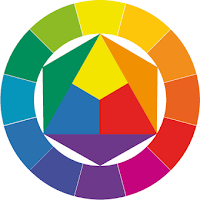
By way of introduction to color design, let us develop the 12-hue color circle from the primaries - yellow, red, and blue. As we know, a person with normal vision can identify a red that is neither bluish, nor yellowish; a yellow that is neither greenish, nor reddish; and a blue that is neither greenish, nor reddish. In examining each color, it is important to view it against a neutral gray background.
The primary colors must be defined with the greatest possible accuracy. We place them in an equilateral triangle with yellow at the top, red at the lower right. and blue at the lower left.

About this triangle we circumscribe a circle, in which we inscribe a regular hexagon. In the isosceles triangles between adjacent sides of the hexagon, we place three mixed colors, each composed of two primaries. Thus we obtain the secondary colors:

yellow + red = orange
yellow + blue = green
red + blue = violet

The three secondary colors have to be mixed very carefully. They must not lean towards either primary component. You will note that it is no easy task to obtain the secondaries by mixture. Orange must be neither too red, nor too yellow; violet neither too red, nor too blue; and green must be neither too yellow, nor too blue.

Now, at a convenient radius outside the first circle, let us draw another circle, and divide the ring between them into twelve equal sectors. In this ring, we repeat the primaries and secondaries at their appropriate locations, leaving a blank sector between every two colors.

In these blank sectors, we then paint the tertiary colors, each of which results from mixing a primary with a secondary, as follows:

yellow + orange = yellow-orange
red + orange = red-orange
red + violet = red-violet
blue + violet = blue-violet
blue + green = blue-green
yellow + green = yellow-green
Thus we have constructed a regular 12-hue color circle in which each hue has its unmistakable place. The sequence of the colors is that of the rainbow or natural spectrum.

Newton obtained a continuous color circle of this kind by supplementing the spectral hues with purple, between red and violet. So the color circle is an artificially augmented spectrum.

The twelve hues are evenly spaced, with complementary colors diametrically opposite each other. One can accurately visualize any of these twelve hues at any time, and any intermediate tones are easily located. I think it is a waste of time for the colorist to practice making 24-hue, or 100 hue, color circles. Can any painter, unaided, visualize Color No.83 of a 100-hue circle?

Unless our color names correspond to precise ideas, no useful discussion of colors is possible. I must see my twelve tones as precisely as a musician hears the twelve tones of his chromatic scale.

Delacroix kept a color circle mounted on a wall of his studio, each color labeled with possible combinations. The Impressionists, Cezanne, Van Gogh, Signac, Seurat, and others, esteemed Delacroix as an eminent colorist. Delacroix, rather than Cezanne, is the founder of the tendency, among modern artists, to construct works upon logical, objective color principles, so achieving a heightened degree of order and truth.

read more

Color Glossary I

achromatic
without hue

analogous hues
1. hues that lie adjacent to each other on the color wheel; contain two, but never three, primaries; and have the same hue dominant in all samples.
2. analogy exists when all elements in a color group contain a readily discernable common hue and only two primary colors are present.

complementary colors
hues that lie directly opposite each other on the color wheel.
when a pair of complementary colors is mixed, the resulting mix absorbs almost all of the light waves, thus resulting in a mixture that has no discernable hue.

co-primaries
the result of the subdivision of the primary triad into three pairs consisting of two versions of each hue.

hue
the name given to a color based on its location in the color spectrum.

monochromatic
a color scheme based on one hue.

overtone
a term used to describe the secondary hue “bias” of a primary color. For example, alizarin crimson is a red that leans toward violet, while scarlet is a red that has an orange bias.

primary triad
composed of red, yellow, and blue, which are equidistant from each other on the color wheel.
it is called primary, because, theoretically, all other colors can be mixed from it.

range of hue
overall configuration of hues in a given image.
the range of hue in a piece of art or design can be described as broad, medium, or narrow.

saturation
refers to the relative purity of hue present in a color. A highly saturated color vividly shows a strong presence of hue; conversely, low saturation refers to a weak hue presence.

secondary triad
orange, green, and violet.
they are called secondary because each can be made by combining two primaries.

split complementaries
colors that are adjacent to the complementary of a color.

subtractive color
color seen in pigment as the result of reflected/absorbed light, as opposed to additive color which is color as seen in light. Additive color primaries are red, green, and blue-violet; when they are combined, the result is white light

tertiary colors
also called intermediate colors, they result from the combination of a primary color with an adjacent secondary color.

triadic hues
color relationships based on any three equidistant hues on the color wheel.

value
the relative quality of lightness or darkness in a color.


Sources: Color – A Workshop Approach by David Hornung and Understanding Color by Linda Holtzschue

read more